Color
Choose color by the job it has to do. Decoration, interface state, categorical distinction, and quantitative encoding have different requirements.
Palette types
Do not encode meaning with color alone. Pair status colors with text, icons, line styles, shapes, or direct labels. A chart that becomes ambiguous in grayscale or under common color-vision deficiencies needs another cue.
 Open full-size image
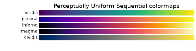
Sequential palettes: follow viridis from its dark end to its light end. This progression can encode increasing magnitude without introducing a special midpoint.
 Open full-size image
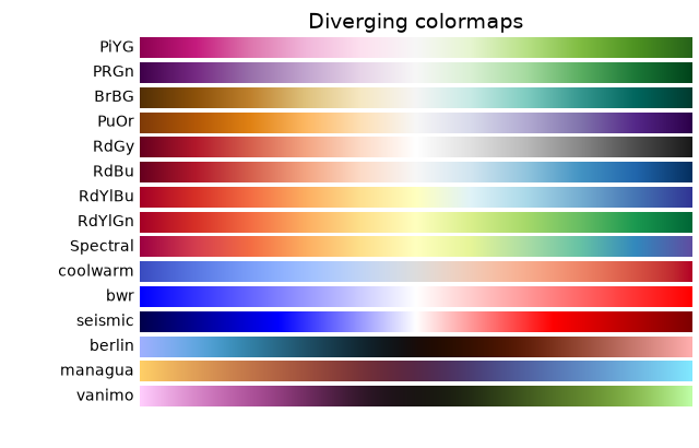
Diverging palettes: RdBu has two colored ends around a pale center. Place that center at a meaningful reference, such as zero change, so readers can see both direction and distance from the reference.
 Open full-size image
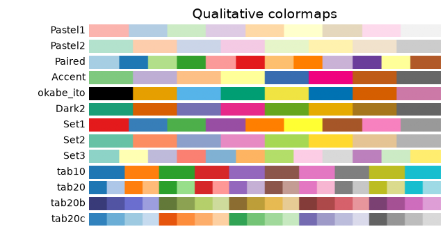
Qualitative palettes: individual swatches identify categories. Their left-to-right order does not assign a numerical rank. Keep category names or symbols visible when colors are similar.
Contrast and context
Text and essential controls need enough contrast against their background. Check normal, hover, focus, disabled, light-theme, and dark-theme states rather than testing one isolated swatch. Larger chart marks can tolerate relationships that would be unreadable for small text.
For data visualization, avoid treating red and green as a universally readable opposite pair. A blue–orange diverging palette is often easier to distinguish, but it still needs testing; no hue pair replaces contrast and redundant labeling.
A practical process
- Decide whether the data are sequential, diverging, or categorical.
- Start with a palette designed for that role rather than assembling unrelated colors.
- Test the rendered design at its real size in light and dark contexts.
- Simulate common color-vision deficiencies and inspect a grayscale view.
- Verify text and control contrast with the applicable WCAG criteria.
- Ask whether the same information remains understandable without color.
Useful tools
- ColorBrewer provides tested sequential, diverging, and qualitative palettes for maps and charts.
- WebAIM Contrast Checker checks foreground/background contrast.
- Adobe Color accessibility tools can inspect contrast and color-blind-safe relationships.
- Browser developer tools can emulate vision deficiencies and test the actual page rather than a detached palette.
A palette is successful when readers can recover the intended structure quickly—not when every color looks striking on its own.
Follow Chrome DevTools’ vision-deficiency emulation guide on the rendered page, then check whether labels, shapes, and line styles still distinguish categories when colors become harder to separate.